
Project 11
MyMTA Mobile App Redesign
Redesigning NYC transit navigation so first-time riders and commuters can find, pay, and travel without getting lost.
Accessibility
Transit
Role
UX Research & UI Design
Timeline
10 weeks
team
Solo (NYU UX course)
platform
Mobile
Tools
Web
The Problem
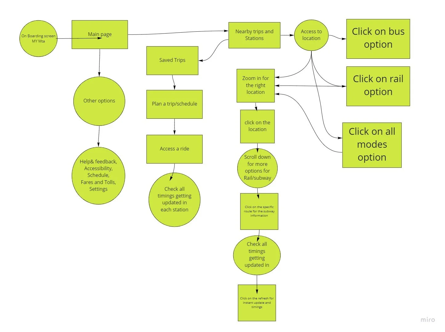
The MTA app takes real effort to learn. New riders and busy commuters spend so long figuring out how it works that many give up and switch to another navigation app for ease and to save time. The core question for this NYU UX course project: how do we redesign the app to make it more understandable and functional so that everyone can use it?
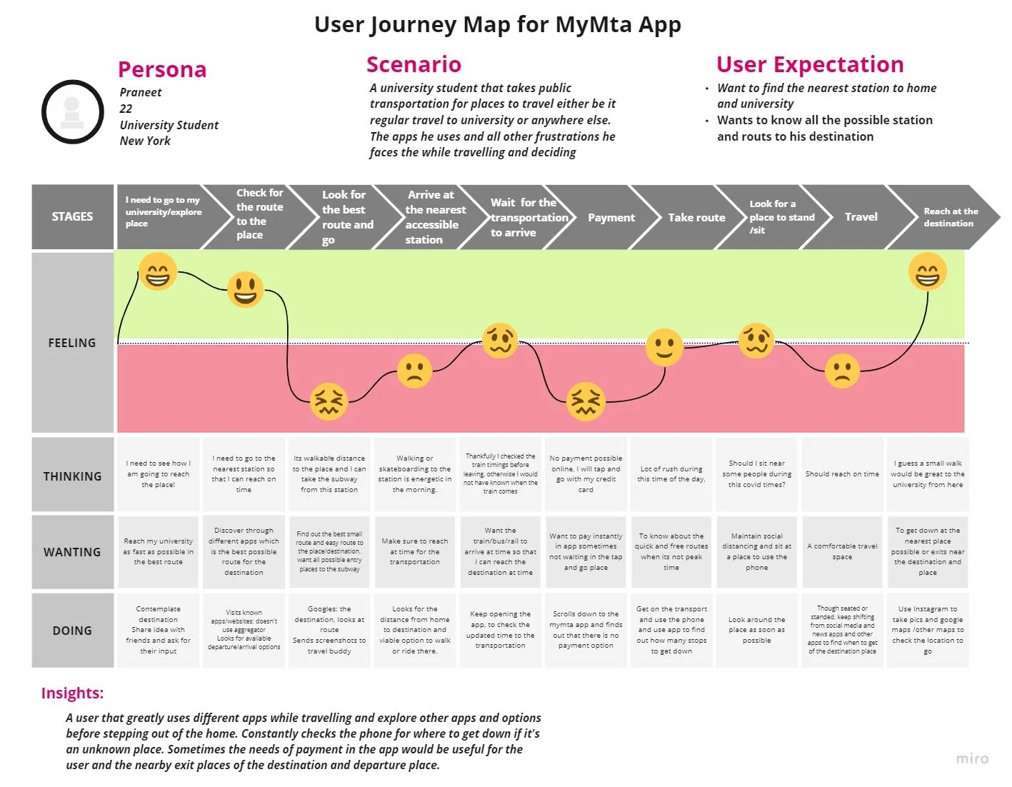
Mapping a rider's trip end-to-end surfaced where frustration spikes: payment, navigation, and real-time info.
Research
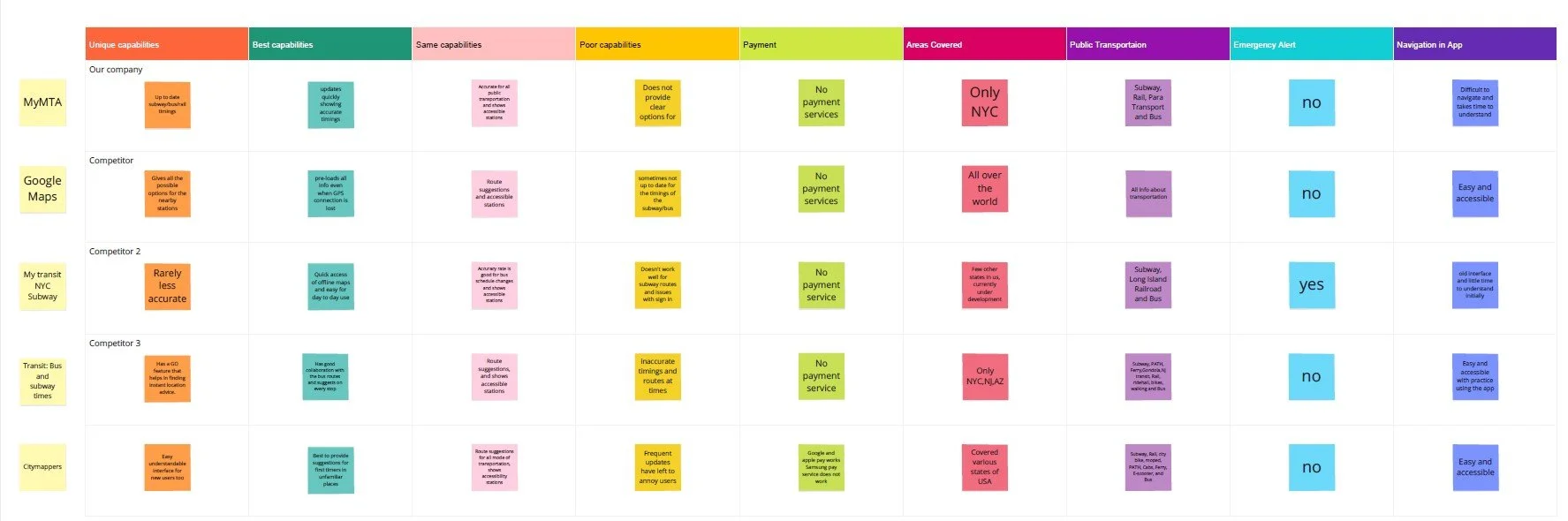
Over six weeks I researched, ideated, prototyped, gathered feedback, and presented. The central user problem: people can't understand the app's flow and navigation. I ran a competitive analysis whose main takeaways were payment, navigation, and information, then conducted user interviews with 4 people (two students new to NYC, two commuters), plus usability tests and a survey with nearly 25 users.
Comparing MyMTA, Google Maps, and other transit apps across payment, navigation, and accessibility.
What I Heard
Key things riders wanted: to find detailed places on the map and know where to go, to know which stops are accessible (useful when carrying large bags), and less clutter "too much information, hard to understand." The main problems: navigation and immediate information, instant payment / tap-and-go, knowing where the transportation is, and how long the app takes to understand on a busy day.
Goals: reach the destination quickly when delayed, get info at the current location, find alternatives, and pay fast.
Pain points: can't recharge the card in-app, waiting in the wrong place, unpredictable timings, long confusing delay alerts.
Designing the Solution
I prioritized features into Must-Haves (map, timing, stops, routes, modes of transportation) and Should-Haves (frequent/saved routes, favorites, delay alerts, route suggestions, current location, payment, help), then built a style guide and designed the solution screens.


A clear visual system and redesigned Subway, Where-to, and search flows.
The Accessibility Feature
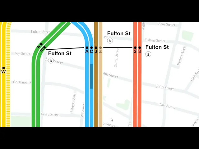
I added an accessibility toggle directly in search. Many travel apps skip this, and it's essential for the accessibility of public transportation — riders can see which trips and stops are accessible before they travel.
Conclusion
This project let me research, analyze, and integrate changes to make the app more usable with a better user experience. The redesign centered the three things riders actually struggled with payment, navigation, and real-time info, and added an accessibility toggle most transit apps skip. Next, I'd like to prototype AR for in-station wayfinding, and showcase the case study to MTA app UX designers to take it a step further.