Project 03
NASA Eclipse Soundscape
An accessibility-first redesign of NASA's Eclipse Soundscape website to WCAG AAA, so blind and low-vision users can experience a total solar eclipse.
Accessibility
UX Research
Role
UX Research · Visual Design · UX Design
Timeline
6 months
team
Jayden Kim, Yiting Zeng and Rithika Repakula
platform
Web
Tools
Adobe CC, Figma, Miro
Client
Arisa Labs × NASA × New York University
Overview
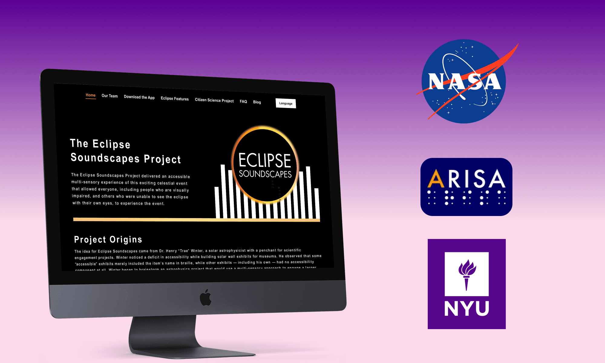
The Eclipse Soundscapes Project delivers an accessible, multi-sensory mobile and web experience of a total solar eclipse, so everyone, including people who are blind or visually impaired, can experience the event. Supported by NASA's Space Science Education Consortium (NSSEC), our goal was an accessible web experience meeting WCAG requirements that better serves low-vision and blind citizen-scientist communities while still benefiting general users.

The Eclipse Soundscapes site: enhancing a celestial event for people who are blind and visually impaired.
The Challenge
How do we design pages to support the Eclipse Soundscapes Citizen Science Project (CSP) so they meet accessibility standards and fit naturally into the existing website?
The Problem
Visual understanding is difficult on the current site. We asked how we might improve the experience for visually impaired and screen-reader users while also benefiting the general user.
Process
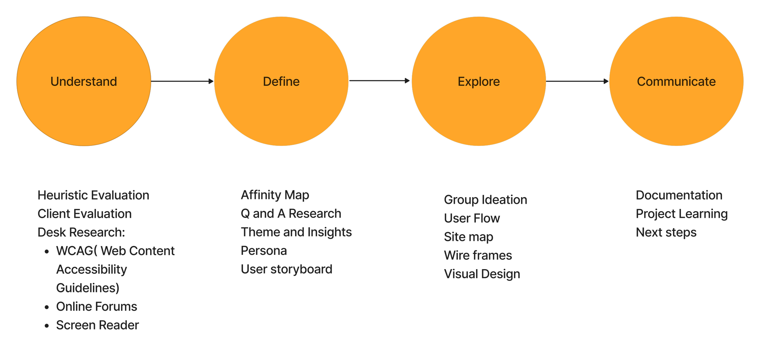
(Understand → Define → Explore → Communicate)
We began with a group Heuristic Evaluation to surface as many usability problems across the existing site as possible, then sorted them into broader, actionable categories.
Below is our four-phase process: Understand, Define, Explore, Communicate.
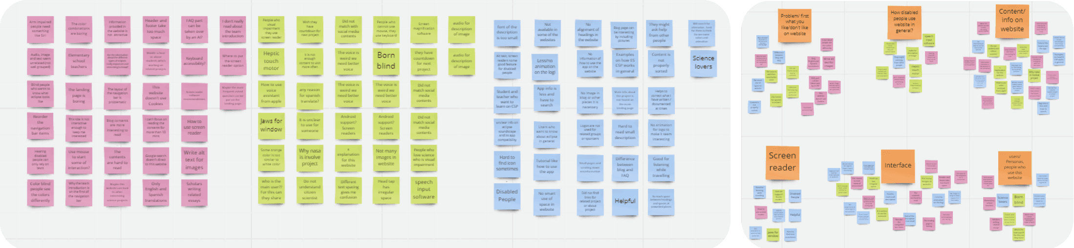
Affinity/heuristic sorting boards-Sorting heuristic-evaluation findings into actionable accessibility themes.
Research
After identifying pain points, we prepared a list of questions for our client, Arisa Labs, to confirm past design decisions from a business perspective. With that fuller picture, we examined the site's information architecture and user flow.
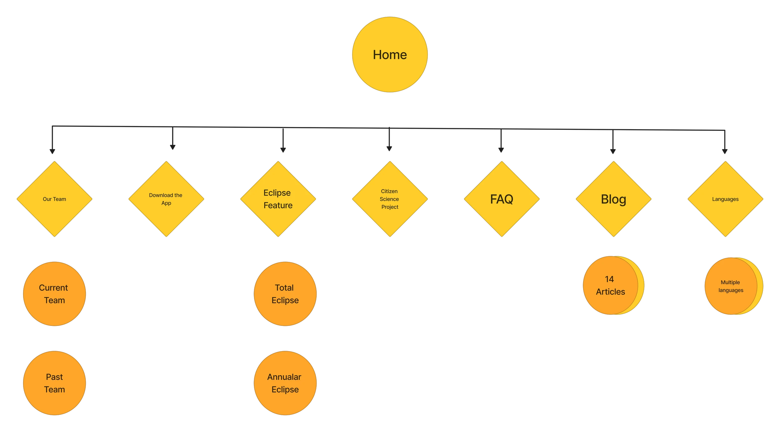
Auditing the existing site's information architecture and navigation.
Themes & Insights
A key realization shaped everything: designing with accessibility is the priority.
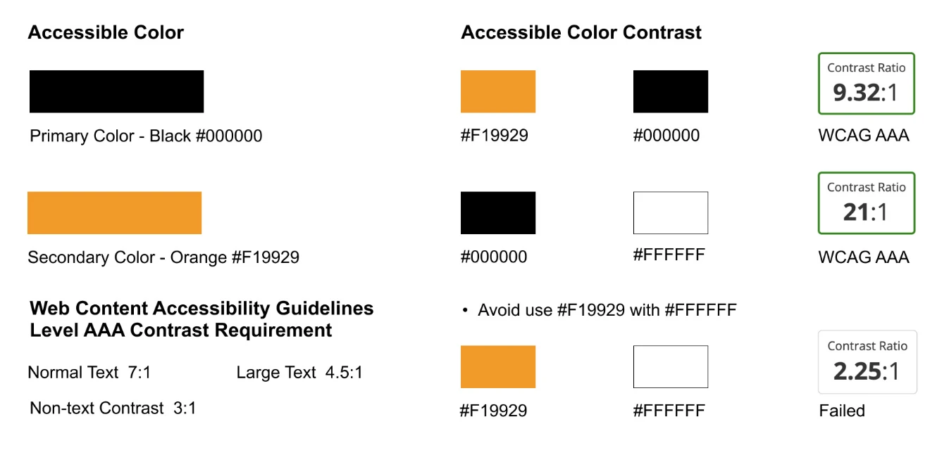
Designing for the visually impaired: high contrast between background and text; accessible color palettes; accessible font, size, and text spacing.
Designing for blind users: video content with audio transcripts; navigation without all-caps; following correct HTML header structure.
How Might We
How might we redesign the pages so everyone can access the website easily?
Low-vision (Indistinguishable): information over background images doesn't contrast well; low-vision users must magnify to read on-screen text. → How might we let low-vision users perceive on-screen information?
Screen-reader (Unsupported): incorrect heading tags make navigation hard; all-caps text can be misread as abbreviations. → How might we make the site more accessible to screen-reader users?
Mapping screen-reader and low-vision journeys to find where the experience broke down.

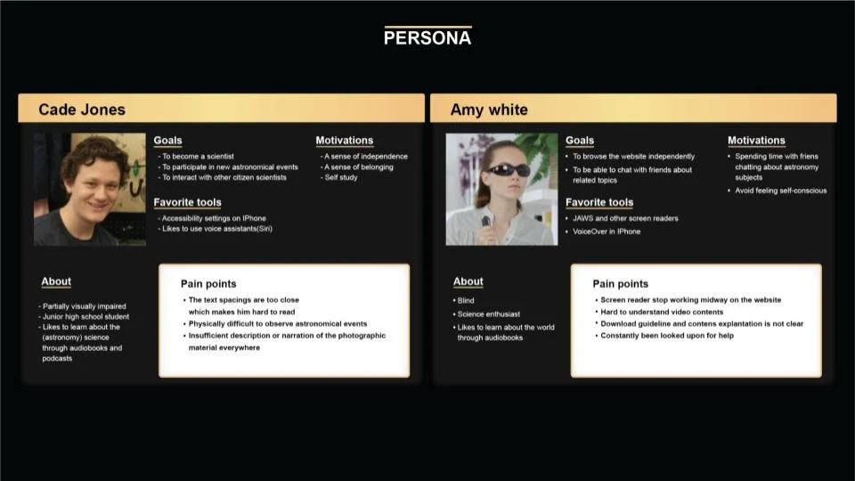
Two personas: a low-vision student and a blind screen-reader user. Grounded every design decision in real access needs.
Design & WCAG AAA
Beyond color contrast, awkward component and text spacing hurt readability sitewide. To meet WCAG Level AAA, line height must be at least 1.5× the font size and letter spacing at least 0.12× the font size. For visually impaired users the most urgent issue was color: without accessible contrast, a high bounce rate is predictable.
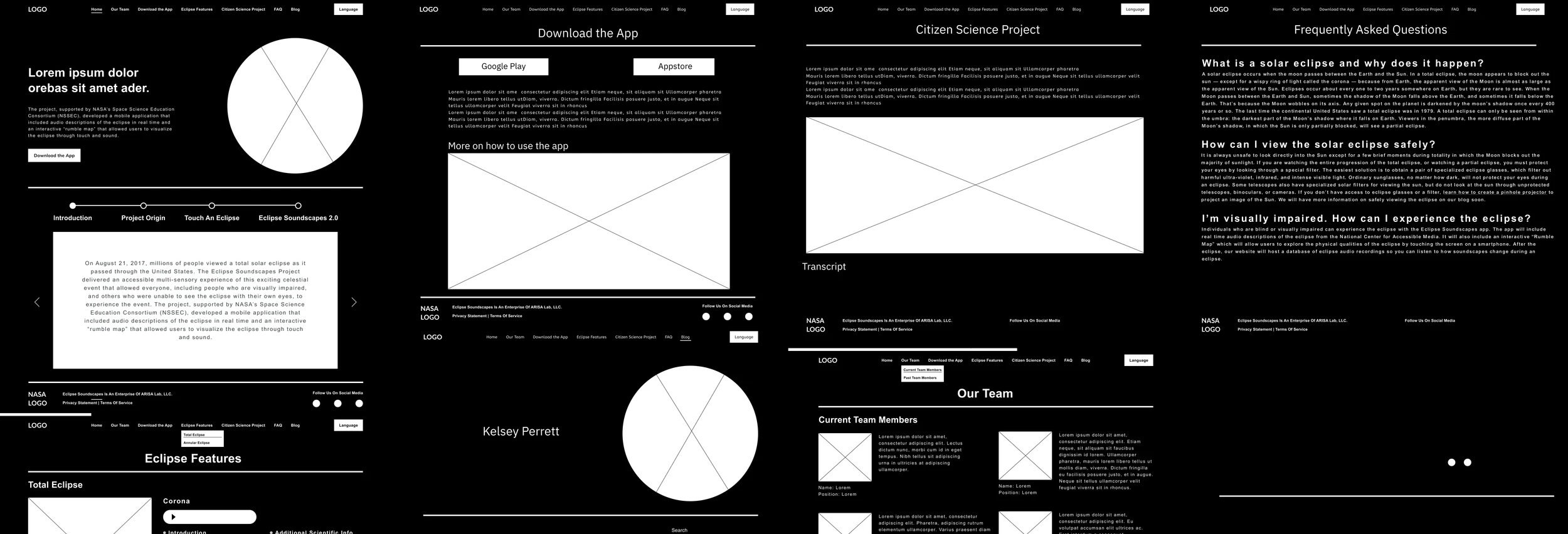
Low-fidelity wireframes for the redesigned pages.
Before → After
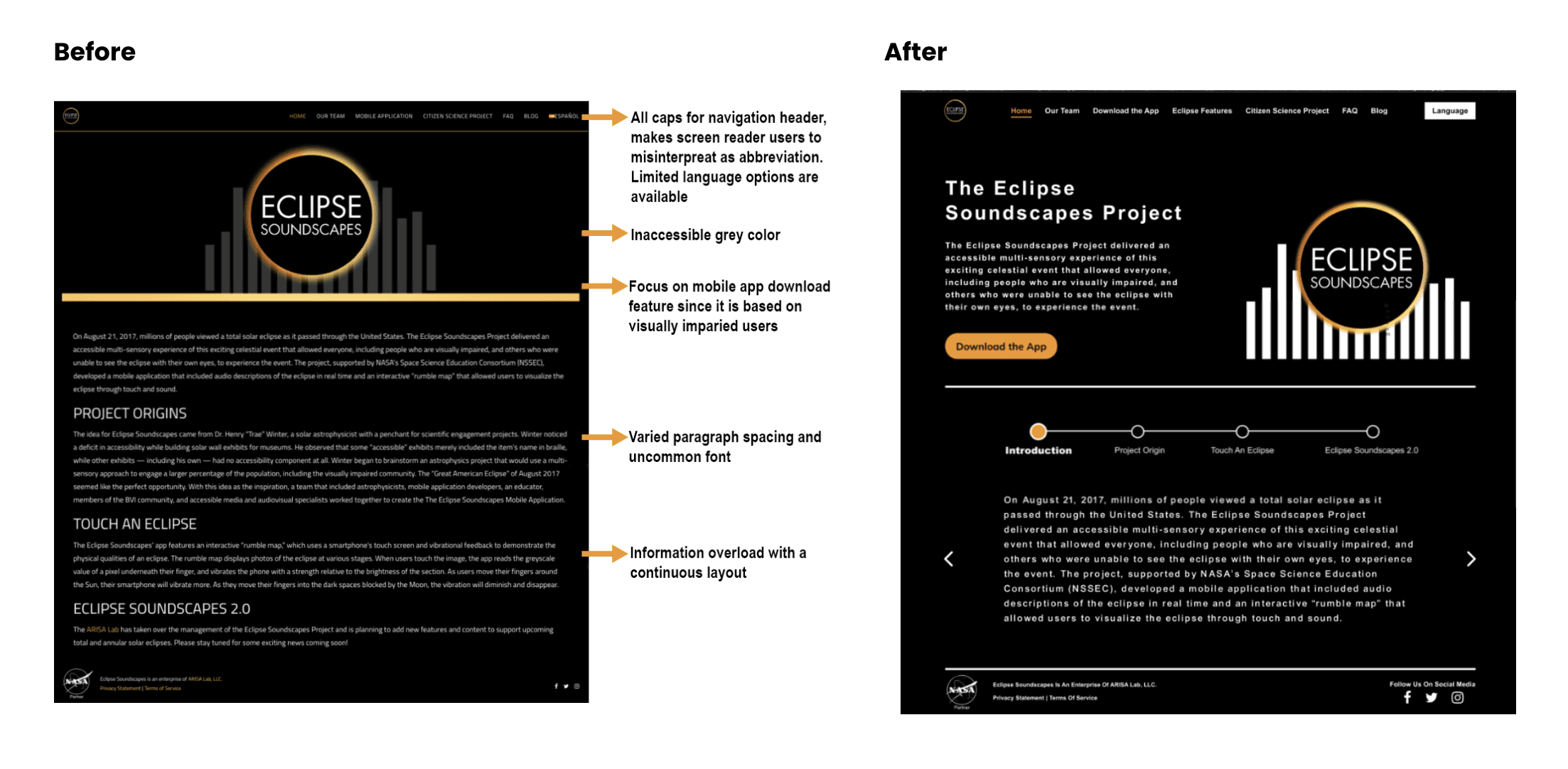
We reworked the site's key pages with suggested heading tags and video transcripts, keeping content crisp and non-redundant.
Homepage: Fixed the all-caps navigation (misread by screen readers), replaced inaccessible grey text and the uncommon font, and broke up the information overload.
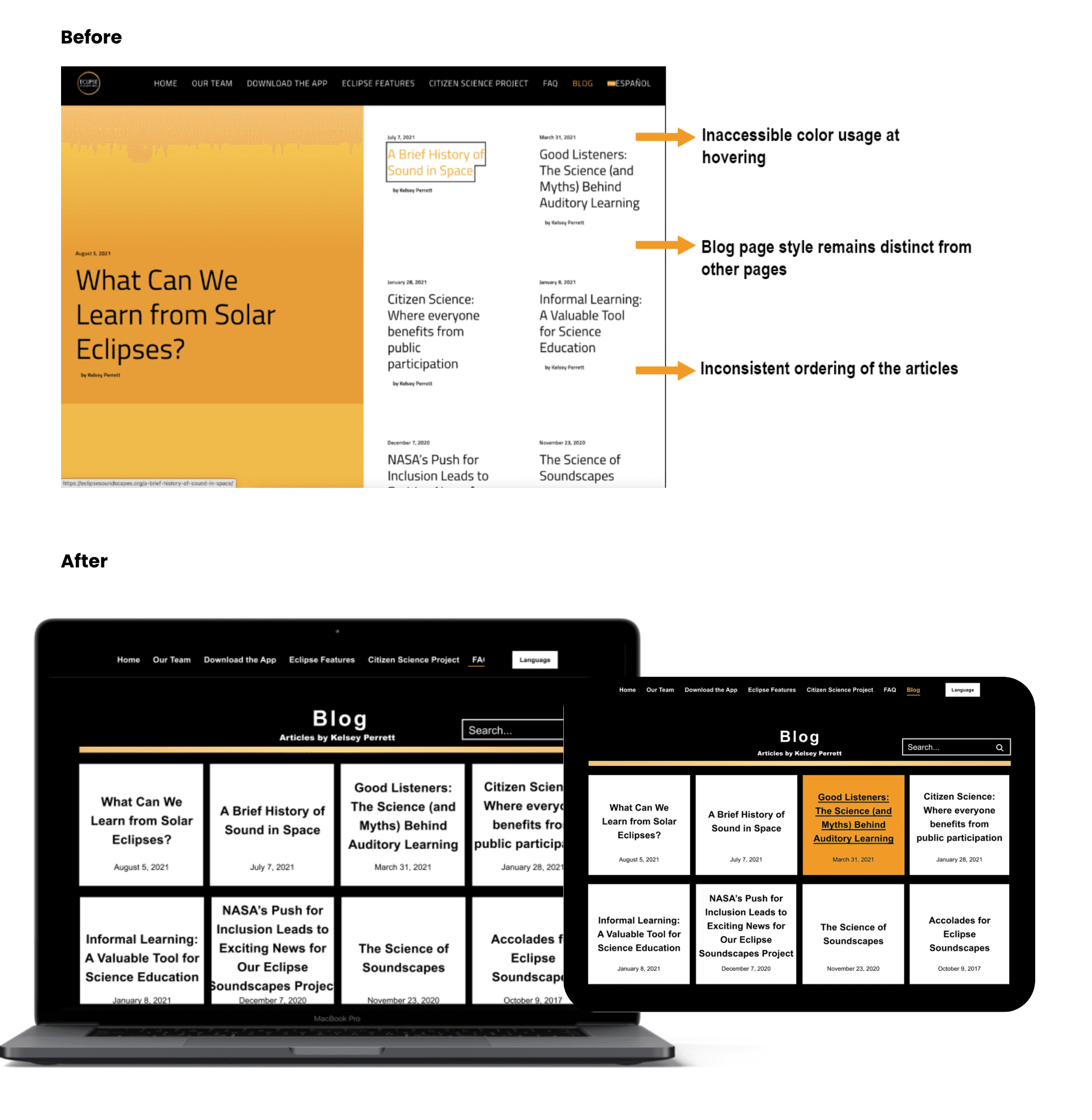
Blog page: Corrected inaccessible hover colors, unified the blog's style with the rest of the site, and fixed the inconsistent ordering of articles.
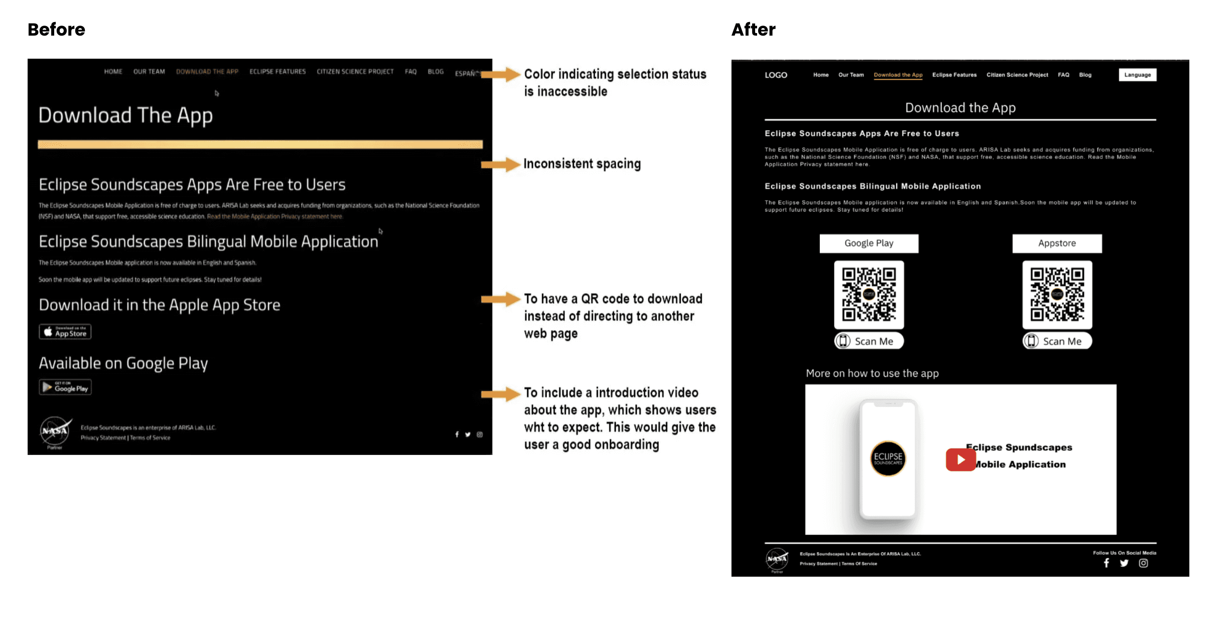
Download the App: Added a QR code and an onboarding intro video, and fixed the inaccessible selection colors and inconsistent spacing.
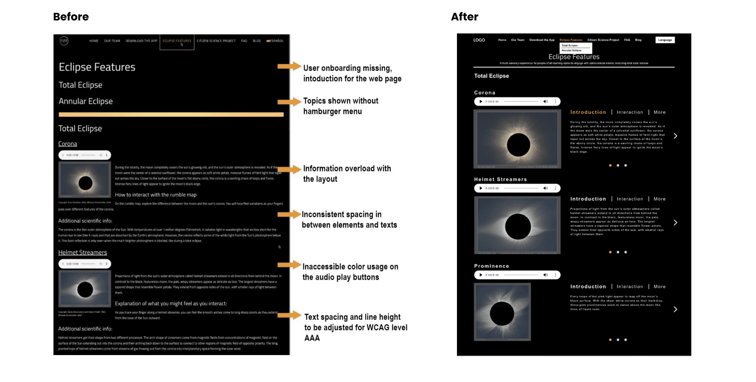
Eclipse Features: Added user onboarding and a hamburger menu for topics, reduced information overload, and set line height and letter spacing to WCAG AAA.
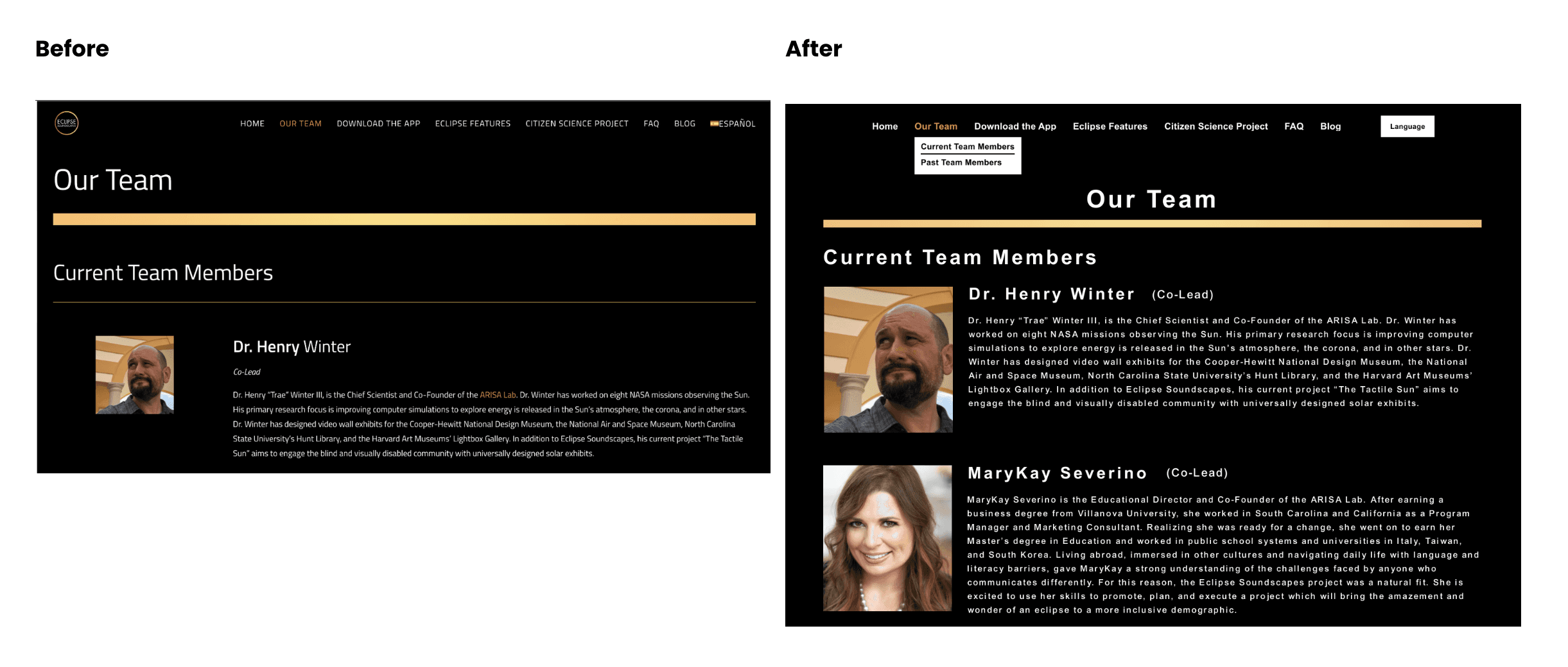
Our Team: Restructured with proper heading tags and crisp, non-redundant content.
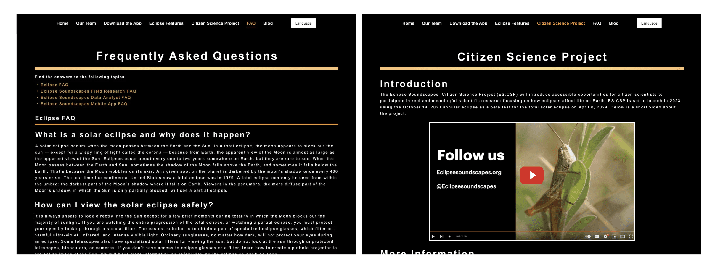
FAQ & Citizen Science Project: Added suitable heading tags and video transcripts so screen-reader users can follow the content.
Conclusion & Future Iterations
We presented our suggestions and research to Arisa Labs and NASA to help make the site serve blind and low-vision communities. All of the team's recommendations and research were accepted and taken into consideration for future improvements to the application.